DFS
Clarifying A Complex Brand-System
Industry
The Challenge
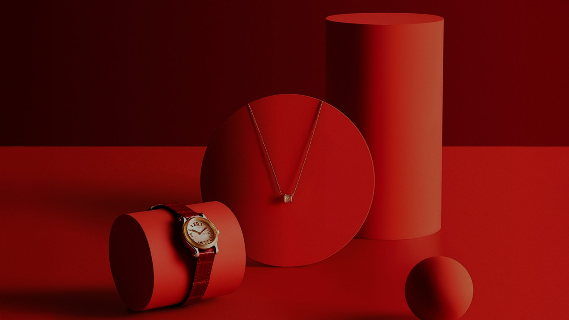
Is a global travel retailer of luxury products based in Hong Kong with a global network of stores situated in major global airports and downtown locations. As a multi-brand retailer, DFS has faced the challenge over the years of maintain visual consistency in its own brand communications. DFS approached Thirty30 to carry out a comprehensive brand audit and deliver a refreshed guideline of visual standards, with accompanying assets and toolkits to enable the marketing team and brand guardians to deploy DFS’s visual identity in a clear and consistent way.
After undertaking a thorough audit across physical and digital platforms, including in-store, online and social media, Thirty30 devised a strategic approach to highlighting key brand assets: namely the DFS Dot and the colour Red. We understood that clear communication required DFS to embrace, embody and infuse its brand codes into its customer experience design. Our team set about identifying how these codes could be translated using framing devices for imagery, visual merchandising components, styling and accessories for garments, photographic lighting techniques, typography layouts and motion graphics.
Each of these codes was broken down into constituent parts and guidelines developed to demonstrate, in detail, how to creatively deploy the codes across a wide variety of communication types.
A Marathon Not a Sprint
Maintaining visual consistency is a challenge encountered by all brands. We supported DFS through block planning and developing a ‘visual thread’, as well as defining lock-up, illustrative, graphic and typographic guidelines for use with evergreen and seasonal assets. These guidelines have been invaluable in supporting the in-house team to produce dynamic and interesting imagery across categories and regions, all the while retaining the visual thread that enables DFS to leverage its Masterbrand and brand codes throughout its complex communications touchpoints.


An Expression of One's Best Self at Rosewood

Positioning A Cotemporary Luxury Brand
Italian Precision for Every Day